Problem statement
The platform is used by intelligence analysts, law enforcement, and cybersecurity professionals. The stakes are real: a missed signal or a delayed decision has direct operational consequences.
The dashboard had grown by accumulation. Every new feature was layered on top of the last, and the result was an interface that showed everything but communicated nothing. Critical signals shared the same visual weight as routine ones. Data appeared without context. Core actions were buried behind multiple clicks.
Users were not slow. The interface was.

Discovery & Research
The redesign had to preserve all existing workflows, support users with very different expertise levels, and scale without repeating the same structural problem. The guiding principle was simple: surface what matters most right now, before anything else.
Design
Each view now leads with the most critical signal for that user type, making priority visible at a glance. Raw numbers were replaced with trend indicators and time-based context, so analysts can interpret data without extra cognitive work.
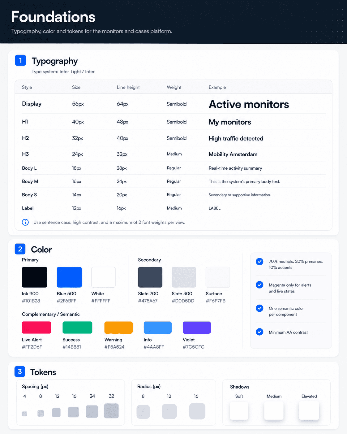
The most frequent actions were surfaced where decisions already happen, cutting average click depth from 3.8 to 1.4. The UI was rebuilt as a modular component system designed to scale.


Results
Launched Q4 2024 internally, rolled out to the full user base in Q1 2025.
Click depth for core actions dropped from 3.8 to 1.4, measured via session data. New analyst onboarding went from two training sessions to one. The component system was extended to 4 additional product areas within 6 months. Power users described the redesigned interface as getting out of the way of their work, which is the strongest signal a tool like this can get.
Business-level metrics are tracked internally and not shared publicly.